

EVERYONE EXPECTED RICCARDO TISCI’S DEBUT FOR THE BRITISH HERITAGE LABEL TO BE A HYPED-OUT, CELEBRITY– CHARGED AFFAIR – AND THEN IT WAS ANYTHING BUT.


EVERYONE EXPECTED RICCARDO TISCI’S DEBUT FOR THE BRITISH HERITAGE LABEL TO BE A HYPED-OUT, CELEBRITY– CHARGED AFFAIR – AND THEN IT WAS ANYTHING BUT. AND THAT’S WHY HE’S ONE OF FASHION’S GREATEST RADICALS. KENG YANG SHUEN REPORTS.

It was one of the most highly anticipated shows of Spring/Summer 2019: Riccardo Tisci, the Italian designer who – through the 2000s – ingrained Givenchy with a pulsing, darkly glamorous and covetable edge, debuting at the 163-year-old Burberry, the most British of brands. Already in the months leading up to it, he had stoked hype and the Internet fire by revealing plans for Supremestyle 24-hour capsule drops; a radical, gallery-inspired makeover of its Regent Street flagship in London, complete with an interactive installation; and a collaboration with fashion’s high priestess of punk Vivienne Westwood. Of course, there was also a new logo (sans serif, naturally) and an inescapable monogram comprising the interlocking letters “T” and “B” – the initials of house founder Thomas Burberry – designed jointly with rock star graphic designer Peter Saville.
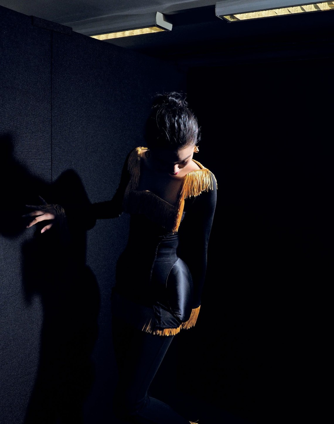
Then came show day last September and, for all the grandiosity of the collection’s title, Kingdom, it was surprisingly – some might say strangely – calm. Held in a cavernous mail centre in Vauxhall, London, the show didn’t have a single celebrity – much less any blue chip names a la the Kardashians Tisci’s known to cavort with – in the front row. And then the opening salvo: a plain, pared-back take on Burberry’s emblematic trench coat, buttoned up and cinched with a thick corset-like belt. It set the neutral (and largely neutral-hued) tone for the next 40 or so looks – a stream of polished separates with a frisson of sensuality. Leather pencil skirts, silky pussy-bow blouses, more coats that got increasingly bedecked through the sequence – ringed or feathered while remaining simple and womanly.
They make for beautiful pieces in any professional’s wardrobe (think Amal Clooney), yet they’re also uncharacteristically discreet for the heavily street wear-influenced Tisci and a major debut. And it was exactly what the 44-year-old designer wanted. Fashion needs sophistication, he told Vogue post-show. “I know we all talk about street and I was one of the first (to do luxury streetwear), but we forget about sophisticated cuts and Savile Row tailoring.” In a market overrun by designer tees, sneakers and sweatshirts, it’s a welcomed acknowledgement and a refreshing, if bold, statement.
Still, there was plenty to appeal to fans of the street aesthetic Tisci’s come to be known for. The second act in his collection, nicknamed “Relaxed”, featured miniskirts; Mary Jane creepers; shorts, shirts and outers with animal prints (cow, leopard, deer); and an abundance of punkish references including grommets, bondagestyle belts and a slogan that references the ’80s Sex Pistols song Who Killed Bambi?. Succeeding this youthful offering and rounding off the collection: seven fluid, minimally embellished black jersey gowns; an effortless and grown-up take on evening wear plainly dubbed “Evening”. In total, 134 looks including menswear went down the runway, with everyone from modern socialites to raver kids to chic corporate types covered.
Tisci’s vision for Burberry is ultimately meant to be an inclusive one. “Why just offer one identity when you can really design for every age, every culture and every different lifestyle?” he said in an interview with Women’s Wear Daily. Being all-embracing has become a common call in fashion today, but Tisci seems motivated less by trends than by a genuine affinity and respect for, well, everything and everyone. (About two weeks before the show, the brand announced that it would stop the use of real fur starting from his debut, as well as the practice of destroying unsold inventory from past seasons as part of its updated responsibility agenda.)
For his first ad campaign with the label, he enlisted six lensmen spanning the established (Nick Knight, Danko Steiner) to the relatively obscure (Peter Langer, Letty Schmiterlow) to capture a diverse cast of models in his collection. “The thing that excites me the most about Burberry is how inclusive it is – it appeals to everyone no matter their age, their social standing, their race, their gender,” he said in a release. “I pulled together six photographers all with a very different energy, experience and point of view of the world... to interpret this new Burberry era and the multigenerational men and women we speak to, all through their own unique eyes.”
It might also explain his first bag for the house, the TB: an elegant, softly boxy number available as a shoulder bag, envelope clutch or elevated bumbag. Besides a handcrafted clasp in the form of the brand’s new monogram logo after which it’s named, it’s completely fuss-free; sensible in style and function with a wide enough range of sizes and colour ways to suit a multitude of women. And this perhaps best captures Tisci’s disruptive streak at Burberry: For all the hype that he can command, he understands that the best – and most lacking – sort of fashion today must be sensitive to the real world.


SV
STUART VEVERS, THE BRITISH DESIGNER WHO HELPED MAKE AMERICANA GREAT AGAIN, TELLS IMRAN JALAL WHAT DEFINES AND MAKES AMERICAN FASHION GREAT RIGHT NOW, IN THIS EXCLUSIVE INTERVIEW IN NEW YORK.
A lot has changed in the Land of the Free since Stuart Vevers revealed his first collection as executive creative director at Coach five years ago. Yes, Trump, but also plenty of shake-ups on the fashion front (some Trumpa induced) that are revealing of the state of American style and, in turn, culture today.
While some of the country’s most well-loved clothing brands have either shuttered or seen once-lauded head designers come and go, a new generation of socially “woke” young names have ignited international buzz with their politically charged shows and collections. Industry veterans who helped define the American sportswear aesthetic have recemented their iconic status with milestone anniversaries, yet it was one supreme skatewear-turned streetwear guru who was given the top menswear prize by the Council of Fashion Designers of America last year.
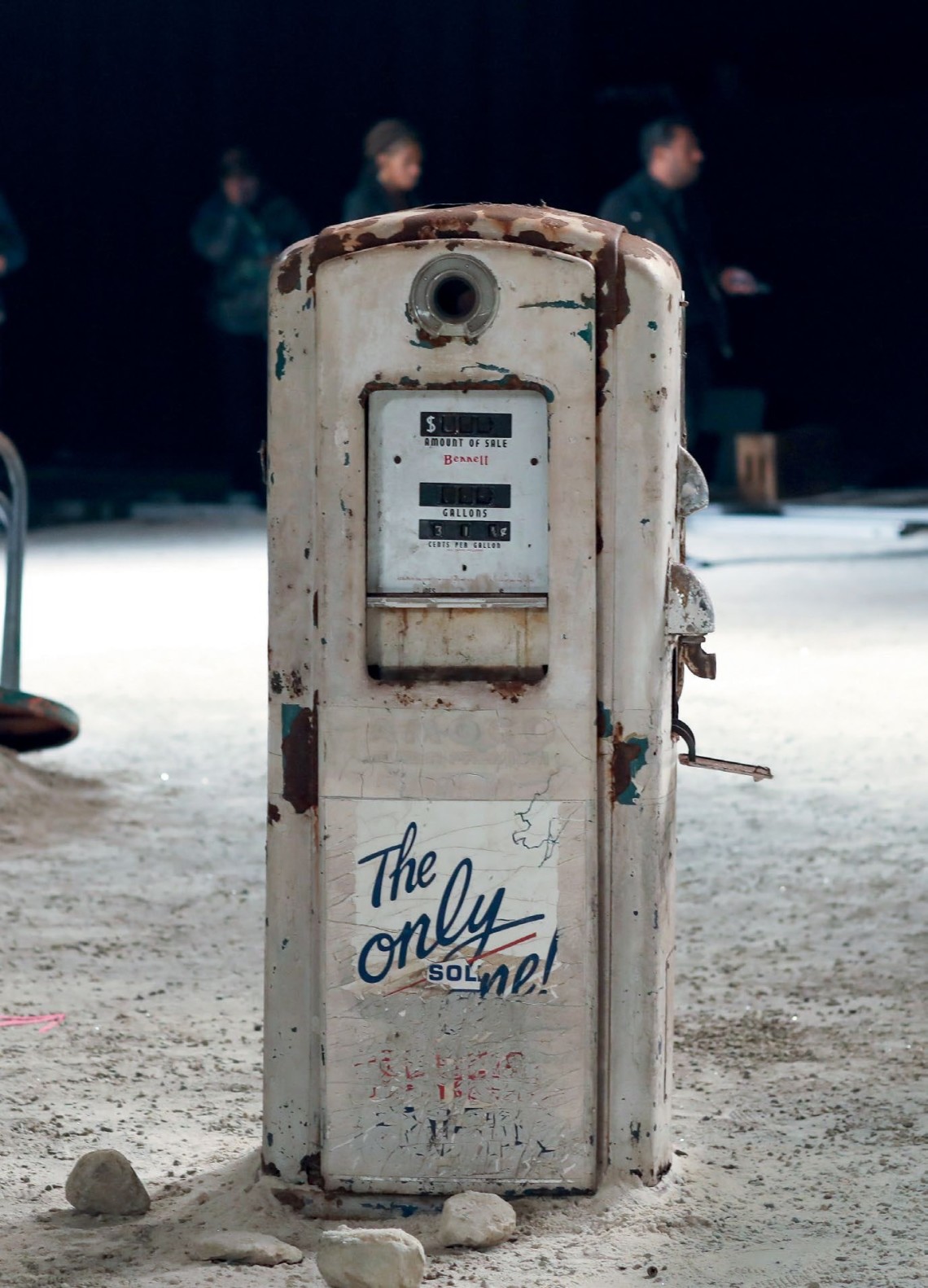
Through all this, Vevers – British-born, largely UK and Europe trained – has stayed true to the romantic-meets-rebellious, Americana-inflected vision he brought to Coach from day one, building upon it in scale and depth season after season. For S/S ’19, he was inspired by a trip to the mystical Ghost Ranch in Santa Fe, New Mexico – a sprawling dude ranch and famed fossil site that Georgia O’Keeffe not only often painted, but also called home.
It explains the show’s set at New York Fashion Week last September, strewn with the likes of a time- and weather-beaten vintage car and gas pump, and a giant dinosaur sculpture made from antique scrap metal to conjure a post-apocalyptic Wild West. Jurassic reptiles have become something of a house motif under Vevers, and this one has been lovingly christened “Bronty”.
The collection itself features all the styles he made signature since introducing a full-fledged ready-to-wear line with his debut: the prairie dresses; baseball jackets and rugged, cowboy-inspired leather outers; a side of fun knits and sweatshirts. The Ghost Ranch influences are evident in fringing and a broodingly pretty colour palette, but the main twist lies in how everything’s more dramatic and a hint more glamorous than usual – billowing volumes; shiny, evening-appropriate finishes; ruffles that take an everyday blouse or dress into statement territory.
“I would say there’s a bit more fantasy in this collection,” says Vevers. Thinking of how to kit brand ambassador Selena Gomez out for high profile events in a “very Coach way” has gotten him exploring more about “dressing up the Coach Girl”, he explains.
Still, he readily agrees when one points out that his creative approach has been nothing but consistent. (“It’s important because ready-to-wear is still a very new direction for the brand, and I need to give people the opportunity to understand our identity and the pieces they come to Coach for.”) While many in the industry grapple with increasingly divided tastes, he’s the steady one who – for all his foreignness – seems to have figured out what people want in an all-American wardrobe.
According to the UK edition of GQ last December, Coach’s annual revenue has hit as high as £4 billion (S$7 billion) since Vevers’ arrival. A month before that, New York’s Lincoln Center honoured him with its Women’s Leadership Award at its annual fashion fund-raiser gala for the way Coach – under his helm – is “reshaping the fashion landscape”. So who better to ruminate on the US of A’s new rules and attitudes when it comes to dressing?


Vevers’ steady reinvention of Americana sees him putting a more glamorous spin on staples like the prairie dress, sweatshirt and moto jacket this season.
AMERICA IS THE CAPITAL OF COOL
“At the end of the day, the French have ‘chic’ and America has ‘cool’. The word ‘cool’ is fundamentally an American word, and that cool attitude is for me what I enjoy about American style. Coach and other American labels are not the only ones breaking down luxury – traditional luxury houses (from Europe) are too, but it’s interesting that a lot of their references are American.”
BEING PRECIOUS ISN’T COOL
“What was exciting about joining Coach was how its spirit – a kind of ease and effortlessness, its New York City attitude – felt very relevant to the next generation, which is less constrained by some of the former rules of luxury, where luxury was perceived as an investment… I deliberately choose materials that have inherent natural qualities or play with textures – like not lining this season’s leather coats, or washing the fringed jackets after making them for a distressed feel – to show the beauty in imperfection… Even when we do craft, it’s less about glamorous embellishments and more about making something feel customised, as if the wearer did so herself... Ultimately, I want someone to put on a Coach piece and instantly feel a little bit cooler, and I don’t think you can necessarily get that if it’s too perfect.”
DISPENSE WITH THE FORMALITIES
“People are (placing greater importance) on comfort and I think that (represents) American style really well. Today, a luxury piece can be a playful backpack, a sweatshirt, a T-shirt – this shift has happened very quickly and particularly in the past five years… There are certain moments when people still get all dressed up, but in general, (fashion) is not expected to be as formal as it once was. Even in the workplace, (it’s no longer about) guys in tailored suits and ties… Steve Jobs never wore a suit.”
IN FACT, AMERICAN SPORTSWEAR HAS GOTTEN EVEN MORE CASUAL
“(The term) used to mean a relaxed way of dressing, but now it really means sportswear – T-shirts, sweatshirts and pants, sneakers, hoodies – and it’s become more and more a part of the everyday wardrobe (as opposed to before, when it was meant only for leisure). This new definition is crucial to what we do and has been a part of our collection since I started working here – the humble T-shirt was a huge starting point for me. Even our more elaborate pieces, such as a long dress, never has fit. There’s no formality, and the materials used are always light and soft. I want to bring the ease of a T-shirt into everything that we create.”
DEVIATE FROM WHAT’S ALREADy OUT THERE
“A big part of my role is about finding the next story and the new ideas that people don’t know they want yet… It’s not about reinterpreting what exists, but creating something new. Take the last look in the S/S ’19 collection, for example: Even today, it (feels new) yet is also very Coach to close a fashion show with a combination of a cotton jersey hoodie and super long, voluminous prairie skirt... The new generation of emerging, underground influenced designers in New York are also offering newness by challenging ideas of what a fashion house should be. I’m actually mentoring Telfar Clemens (known for his inclusive, gender-free designs), and I think he’s an example of someone who is creating new rules. Challenging (what came before) is a crucial part of fashion (in general).”

NG
PRACTICALITY
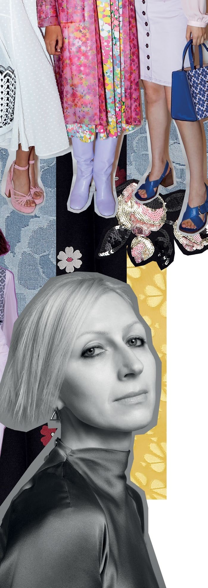
To Glass (this page, in black and white), a modern woman wants stylish pieces that aren’t complicated. The term she used was “polished ease”, and it’s reflected in the collection’s flowy, ’70s-inspired coats, blouses and dresses. Each piece in that last category – many of which are fussfree yet elegant midi length – is designed to be all-in-one, with just the right amount of decorative details like gently ruffled sleeves or a cowl neck, taking the wearer from day-to-night easily.
That same pragmatic approach applies to the brand’s well-loved bags. On its catwalk last September, models strode down armed with a crossbody style and a larger tote or bucket bag. Glass’ reasoning? “Most women need a small, stylish bag that’s able to hold their phones, keys, wallet – the essentials. At the same time, we also usually carry a bigger bag such as a tote to hold work or gym stuff, so this idea of an everyday woman carrying two bags is something that was reflected in a lot of the runway looks.”
REFINEMENT
Glass’ strength is in accessories – she studied jewellery design before joining Gucci (during its Tom Ford era) and Michael Kors in their accessories department. While the brand’s been a favourite for its madefor-everyday bags livened up by fun colours, hardware is what she’s using to distinguish her designs. “(Our hardware) can be done in a bold or subtle way, whether it’s (in the form of) a beautiful enamelled heart, twist-lock or key-rings. They all have this three-dimensional side profile that’s a nod to the shape of the spade (the house symbol), which is where my background in jewellery has really helped,” she says.
Also expect upgraded finishes and more complicated techniques to be used on the leather goods. These include scratch-proof coating, as well as the latticework of spade motifs seen all over the Dorie bucket bag, one of collection’s key styles.
RESTRAINT
The Kate Spade brand is synonymous with playfulness, even cuteness (who can ignore its whimsical novelty bags?). Glass intends to retain that fun factor, but in a subtler, more sophisticated way. For example, what seems like bold polka dots on a bohemian silk dress are in fact retro clover prints up close. “I love this idea that the customer would discover these details (on her own)... a sense of intimacy mixed with novelty,” says Glass.
MODERNITY
Further putting her own cool spin on the label’s chic and cheery aesthetic, Glass’ debut collection introduces an eclectic pairing of colours – a candy floss pink translucent trenchcoat over a sunflower yellow pussy-bow dress, for example. “(The brand’s always been known for colour) and I wanted to do it in a more unexpected way... to add diversity,” she says.
Even her approach to logomania is decidedly fresh, centring around the brand’s spade motif. It’s the key hardware on the Nicola shoulder bag – rendered as small as a bead or slightly oversized for variety – and even graces the perspex heels of sandals. Says Glass: “Many brands look for a logo that carries their name... and sometimes it’s hard to tell what brand it is... So I really wanted to explore the spade (instead).”
INCLUSIVITY
Appealing to different customers is one of Glass’ main tenets. It explains her range of silhouettes and diverse play with colour and the spade motif. She’s also made sure that while she’s improved on quality, prices – particularly of the bags – remain the same as before. “I like the fact that (our products are) at an accessible price point that reaches a broad range of women,” she says. “This really strong message of embracing all types of women is something that leads back to the roots of the brand, and (we) will continue to be known for doing that.”


