

Love the visuals in our magazine or on Instagram? You can style your home to get amazing snaps that seem as effortlessly taken, with these photography and styling tips.


There is no shortage – on the Internet – of interior design ideas, cooking tutorials or insider peeks at a home renovation, whether posted by Instagram friends or celebrity designers. However, these are no longer purely instructive. Online content today is all about visual storytelling, and using clever styling and filters to portray an aspirational lifestyle. As purveyors of good design, we love the conscious effort homeowners are taking to show off their abodes. Here, we consult three photography and styling experts for tips on getting perfectly styled shots of the home’s heart: the kitchen.
TAKE IT FROM THE TOP
C.R. Tan, a food photographer and stylist, is known for his flatlay tablescapes. The founder of boutique creative studio Chun Tsubaki enjoys the process – from styling to ensuring each element is in the right spot.
Involving the coming together of various items, such as food and even furniture, flatlays are one of the best ways to capture the essence of a brand or tell a story. He likes to use platters to create layers, regardless of the material being wood, marble or silverware. “Table napkins, which help break the rigidity of a photo, as well as antique flatware for a rustic touch, are also some of my favourite props,” he says.
The first step is to have a plan. He starts with a theme in mind, and selects colours and surfaces that bring out the features of, as well as complement, the subject. Having a mood board is helpful. “Try and recreate the same angles and prop placements, and keep on practising and crossreferencing other works online. Eventually, you will get the hang of styling and the art of composition.”
PHOTOGRAPHY
Always make sure your camera is perfectly level or parallel to the subject or surface area, to avoid image distortion. “You should also try photographing from different distances. Wide and close-ups shots (each have their benefits).”
LIGHTING
Although he uses natural light as much as possible, commercial work necessitates the use of artificial light to allow for consistency, especially when working on a long project. “For me, the optimal lighting angle for flatlay is always such that the shadow of the subject is cast directly below it.”
STYLING
Choose props that are related to the subject. When styling, avoid overcrowding; negative spaces help show the texture of surfaces, be it your quartz countertop or the carvings on your silverware.


3. The spread is indicative of a celebratory feast at Chinese New Year, but the props – the rattan and wooden chairs – are what evoke a homely, nostalgic feeling.

THROW IN SOME TEXTURE
To Elodie Bellegarde, texture is the backbone of a good photograph. The French food stylist and photographer runs a styling consultancy, and her works portray a wholesome ambience. Texture has a lot to do with this. “A rich, dark and woody texture adds warmth to (my hero subject), while concrete, greys and metal give a ‘colder’ look. It is about counter-balancing within a minimal space,” says Elodie.
However, adding texture is not as simple as using different fabrics and materials. To achieve her signature look, she embraces imperfections. “Creased linen adds a ‘human dimension’ to a photo. I also love to use my hands to introduce movement by dropping ingredients into a bowl, or adding some mess to my photos with torn, opened or imperfect elements,” she says.
It can also be pure serendipity. While Elodie often starts her photos with a story – the composition and style is dictated by the message she wants to share – at times, experimentation births an even prettier result.
“The movement effect in my cheese and wine image was purely accidental. I literally fell off my chair trying (to fix something) and the photo was taken. I was originally going for something a little more ‘dignifying’ but, in the end, preferred that accidental effect,” she shares.
Here are some basic rules:
PHOTOGRAPHY
Keep in mind the lines, be it horizontal or vertical – say, for instance, you have a tiled backsplash – and adjust your camera angle accordingly to avoid distortion. Remove unnecessary distractions, such as an open drawer or the stove, so the composition does not feel cluttered.
LIGHTING
“Understand the light that surrounds you and play with it. A shadow or highlight can turn a bland photo into something so much more interesting when controlled properly. Ceiling light can flatten a space or a subject, so use a side light (from a window) if possible,” she advises.
STYLING
To maintain a good balance, Elodie sticks to two to three colours and plays with different tones within that palette. “I am quite fond of adding flowers to a photograph, too, whether the main subject is food or people. Nature has a big importance to me and in my work, so I try to include some elements whenever I can.”
More of Elodie’s work at www.elodiebellegarde.com.


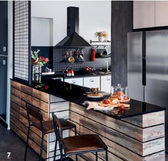
7. As the homeowners have red-hued accessories, Nonie accentuated this vibrant hue further with some tomatoes and flowers.
SHOWCASING YOUR KITCHEN
As someone who oversees the aesthetic of the Home & Decor magazine, as well as is responsible for many of the magazine’s home photo shoots, senior art director Nonie Chen has an undeniable eye for style. However, she admits that even a beautifully designed kitchen can be tricky to shoot.
“To overcome unglamorous details, I take both wide shots and close-ups; the former showcases the overall design of the kitchen while hiding unwanted details, while the latter focuses on the homeowner’s collection of unique crockery or even door knobs,” she says.
She often crops out refrigerators, as the spaceconsuming appliance often takes attention away from the kitchen’s finer details. Props, like for many stylists, are her best tools to complete the look. “I often soften the linearity of kitchen cabinetry and the hardness of a stainless steel sink with coloured porcelain, and plants with large, green leaves. If plants are not the main focus, but I’d like to introduce greenery in the background, I will opt for those with smaller leaves,” shares Nonie.
Other props include lemons, for their vibrant hue; designer teapots to bring attention to a countertop or backsplash; and a loaf of sliced bread for a more lifestyle look. It is also important that the photos reflect the homeowner’s personality, so she tries to use their accessories wherever possible.
Here are some basic rules:
PHOTOGRAPHY
For wide shots, she applies a 70:30 rule, with the former illustrating the main cooking area and the latter focusing on cabinetry. She also selects five to 10 different angles before proceeding with the photo shoot.
LIGHTING
While natural light is good, it is not your only option. “If you have nice ambient lighting, be it from downlights or pendant lamps, it would be nice to see a moody, hotel-like atmosphere, instead of the usual bright and airy look,” she says.
STYLING
In a home setting, props have to make sense. Shoes should not be seen, for instance. A theme, like “afternoon tea” or “breakfast” helps decide between props like wine or tea, bread or cupcake, book or newspaper. “I avoid glassware for its reflective properties, but having tea in it solves the problem,” she says.


10. Take care not to overdo things when styling a space. Here, Nonie used minimal props to keep the focus on the kitchen’s dark elegance.

– NONIE CHEN, HOME & DECOR’S SENIOR ART DIRECTOR


