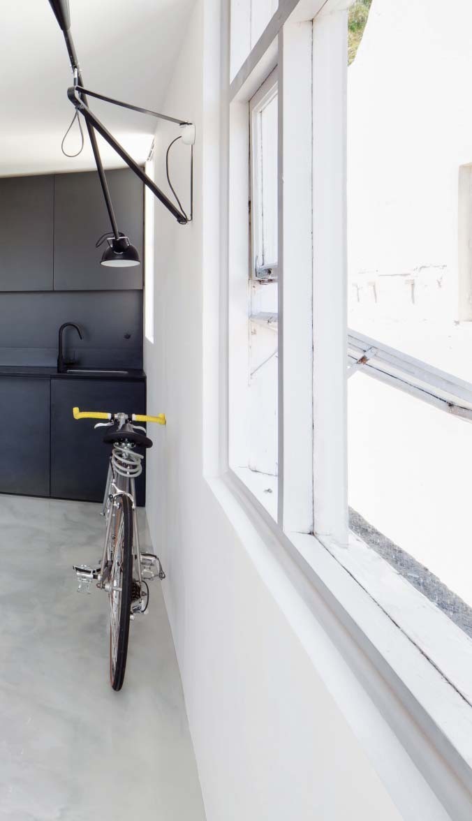
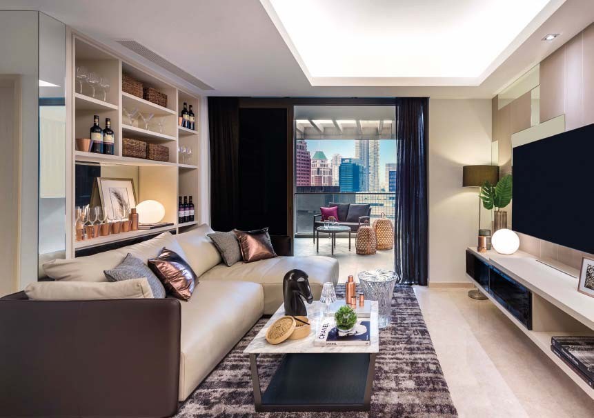
As living spaces in urbanised areas become ever more restricted, homeowners are looking for clever ways to make a small home feel a little larger. Home & Decor speaks to some of the industry's leading professionals to find out just how to save space, while not compromising on style.
As any homeowner will testify, size matters. From floor space to how a room “feels”, achieving an environment that is spacious and harmonious is a priority, especially in our space restricted times. But creating such a home is less about square footage and more about clever design. With a little expert guidance from some of our favourite interior designers, even the daintiest of dwellings can feel positively palatial.
START WITH THE FLOOR PLAN
Before considering the decor, work on the floor plan where possible - with the aim of creating an open, fluid space. "Move any utility or storage rooms to the perimeter of your home to achieve a single, open, central area commensurate with the proportions found in larger apartments, advises Sydney-based interior designer Nicholas Gurney, who is renowned for his skills when it comes to transforming small spaces. If starting from scratch isn't an option, consider removing any unnecessary walls, in order to create a similar feeling of airiness.
ADD AND SUBTRACT
When Nicholas works on a small-scale project, he likes to use a method he calls “add and subtract”. He says: “Murphy beds and folding or extension tables are readily available and are a highly effective solution - add them to the room when you need them and subtract them when you don’t!” Likewise, a butcher’s block on wheels is a nifty extra work surface that can be moved out of sight when not needed.
“MURPHY BEDS AND FOLDING OR EXTENSION TABLES ARE READILY AVAILABLE AND ARE A HIGHLY EFFECTIVE SOLUTION – ADD THEM TO THE ROOM WHEN YOU NEED THEM AND SUBTRACT THEM WHEN YOU DON’T!”
– SYDNEY-BASED INTERIOR DESIGNER NICHOLAS GURNEY
COLOUR IT BEAUTIFUL
While a soft neutral scheme is usually suggested to make a space appear larger, it isn’t necessarily to everybody’s taste. “If what you love is big, bright and bold, then don’t be afraid to show it – no matter how small the rooms may be,” says Nikki Hunt of Design Intervention. “When faced with decorating tiny rooms, it can be tempting to play it safe but colour and pattern can actually make those small rooms fun and inviting. With so much to see, the boundaries will blur.” Mix prints, shades, textures and trinkets for a home so full of personality, you won’t notice its size.
“IF WHAT YOU LOVE IS BIG, BRIGHT AND BOLD, THEN DON’T BE AFRAID TO SHOW IT – NO MATTER HOW SMALL THE ROOMS MAY BE.”
– NIKKI HUNT OF DESIGN INTERVENTION
REVEAL AND CONCEAL
Storage space is often an issue, but there are plenty of ways to increase the functionality of large furniture items to deal with this. Bu Shukun of Architology is a master of disguise, creating bespoke pieces that work twice, if not three times, as hard. “We created a kitchen island that is a stove, dining table and TV console all at the same time. The layering of functions allows the limited space to have multiple dimensions,” he says of a project his team worked on.
“WE CREATED A KITCHEN ISLAND THAT IS A STOVE, DINING TABLE AND TV CONSOLE ALL AT THE SAME TIME.”
– BU SHUKUN OF ARCHITOLOGY
UNIFY YOUR COLOUR PALETTE
A unified colour palette that runs throughout the house will help it feel larger as it decreases visual noise,” explains Caroline Chin-Geyler of Arete Culture, which creates bespoke interiors and furniture for its Singapore clientele. “I like to use predominantly neutral palettes in small homes as it makes the spatial flow feel less ‘choppy’.” Adopting a scheme in clean, soft shades such as taupe, mushroom or beige will also enhance light, naturally amplifying the space of a room or a home. Consider this particularly in areas such as corridors or windowless bathrooms, which will benefit greatly from a lick of fresh, uplifting paint.
LIGHTEN THE ‘LOAD’
Heavy materials and fabrics will immediately weigh a room down, so look at alternatives for some of the larger items of furniture, and play around with soft furnishings and accessories. “Add lashings of reflective materials such as glass and acrylic to lighten the mood,” suggests Jeremy Tay of Prestige Global Design. Trading a solid teak table for a more whimsical, glass-topped one will immediately give the illusion of a larger space, as would replacing heavy drapes with sheers and swopping shaggy rugs for low-pile ones.
“ADD LASHINGS OF REFLECTIVE MATERIALS SUCH AS GLASS AND ACRYLIC TO LIGHTEN THE MOOD.”
– JEREMY TAY OF PRESTIGE GLOBAL DESIGN
CUSTOMISE, CUSTOMISE, CUSTOMISE
The illusion of space is actually down to proportions and ensuring that all of the items within a room interact seamlessly with one another – a giant sofa in a small living room, for example, will visually swamp it, so consider customising furniture to fit. “Instead of buying a smaller scale piece, a custom-made sofa will not only fit a space, but will also remain comfortable, because you can maintain the depth while altering the length,” explains Jeremy.
REFLECT NATURAL LIGHT
Mirrors are the go-to trick for any interior designer looking to create depth and space. Nina Beale of Bungalow 55 likes to arrange three long mirrors along the back wall in a dining room to make it feel grander. It also creates a point of interest on an otherwise blank canvas and is a fresh alternative to a piece of art.
“VERSATILE PIECES OF FURNITURE SUCH AS CERAMIC STOOLS OR UPHOLSTERED OTTOMANS CAN BE USED AS ADDITIONAL SEATING OR SERVERS WHEN ENTERTAINING.”
– NINA BEALE OF BUNGALOW 55
REMOVE UNNECESSARY DOORS
While bedroom and bathroom doors are mandatory, consider removing those that aren’t, and leave a statement door frame instead. Alternatively, sliding doors do the job just as well, and are completely unobtrusive. “Sliding doors built into walls leave you with more wall space,” says Nina Tolstrup of Danish small - scale design experts Studiomama.
THINK OUTSIDE THE BOX
Instead of trying to cram “traditional” furniture into a space, consider whether you really need it or if there might be a more optically pleasing option. Sideboards and seating can often clutter a space unnecessarily but, if you feel that they serve a vital purpose, look at other ways that you might be able to achieve the same result. “Versatile pieces of furniture such as ceramic stools or upholstered ottomans can be used as additional seating or servers when entertaining,” suggests Nina.
text POLLY SWEET


