

This resale flat in Woodlands now has a modern, graphic aesthetic, thanks to a unique grid design and a monochrome palette. MELODY BAY does a walk-through.


Striking artworks give the home a present-day vibe.
WHO LIVES HERE
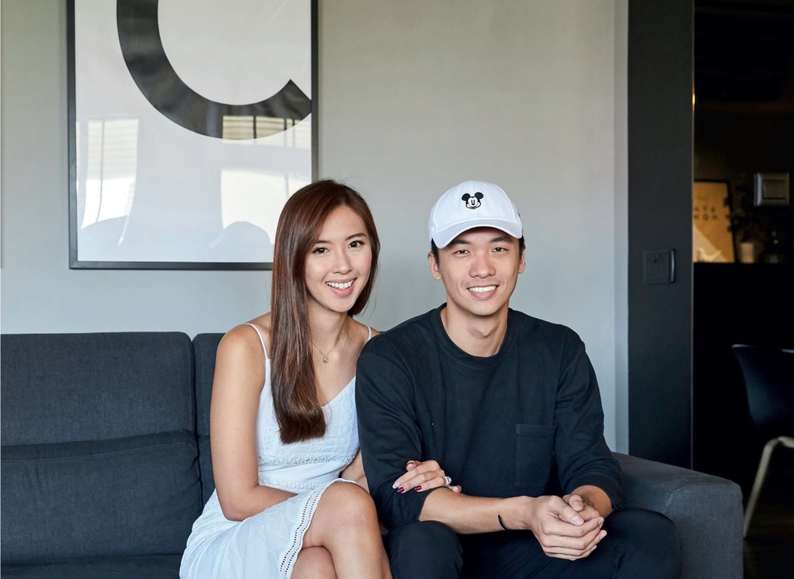
A couple in their late 20s
HOME Executive apartment in Woodlands
SIZE 1,400 sq ft
It is not often that one comes across a home like this executive flat in Woodlands that is both spacious and cosy. Homeowners Ken Chin and Caselyn Lee, a civil servant and financial consultant respectively, prioritised a monochrome palette and hotellish ambience when they approached Sherlynn Low, founder of Millimeters Studio to design their resale flat, which was ready for moving in after a three-month renovation.
Having adequate space for entertaining was a key consideration as the couple has friends and family over quite often. Their goal: an open plan that would allow everyone to move seamlessly from the dining area to the living space. “During celebrations, we want people to feel like they’re together even when they’re in different parts of the home,” says Caselyn. This communal living idea was inspired by Ken’s frequent stays in hostels overseas, where sharing spaces and amenities is usually intentional.
Caselyn and Ken love hosting gatherings – an important consideration in the design.
To achieve this, Sherlynn reconfigured the layout. The original kitchen wall made way for an integrated kitchen and dining space, and one of the three bedrooms was knocked through for a larger master bedroom, en suite bathroom and walk-in wardrobe.
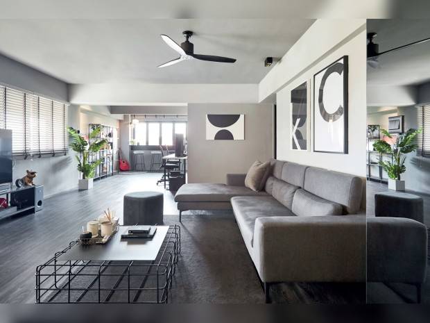
Since socialising over meals is a frequent activity, Sherlynn made the dining area a focal point of the home. The kitchen island and dining table are easily joined together to form one long surface, and the clean lines are mirrored in the grid design that runs the length of the ceiling.

The free-flow kitchen and dining areas, where the table and island are easily combined, invite lots of opportunities for interactions when they have guests over. Another eyecatching detail is the ceiling grid.

Bright yellow task lighting offsets the monochrome kitchen.

Hooks and an ottoman help to create a functional entryway.
“Every home we design has a unique highlight,” says Sherlynn. “For this home, it was the ceiling grid that proved to be a versatile design element. It not only conceals the wiring for the lamps but also allows the couple to hang fairy lights and plants for special occasions.” Although Ken and Caselyn were at first concerned about the grid reducing the height of the ceiling, it has had quite the opposite effect as it draws one’s eye upwards.
This design element is echoed throughout the home. The living room showcases, coffee table and their open-concept wardrobe are great iterations. Combined with the black and grey palette, complemented by a luxe touch via features such as tinted mirrors and chrome finishes, they offer a look that’s both contemporary and industrial. To balance the monochrome scheme, Sherlynn used shades like yellow for the accessories.

The counter by the window provides a cosy working and reading nook for the couple.
Millimeters Studio also curated pieces from the couple’s collection of travel memorabilia to display and even custom-painted bold graphic artworks for the walls. “Those with the alphabets K and C were a housewarming gift,” says Sherlynn. These and the couple’s mementos give their home plenty of personality.
A lot of thought also went into the light and spacious master bathroom with his and hers basins and a luxurious 1.7m-long bathtub.
On top of the elements introduced primarily for entertaining, Sherlynn also allocated plenty of space for we-time. One of the features she introduced was a counter by the living room window with an expansive view of the greenery outside, that has become Ken and Caselyn’s favourite spot for working and reading.
“We wanted our home to have a hotellish vibe so we’d always feel like we’re on a staycation. Sherlynn helped us achieve that,” laughs Caselyn.

The grid design is also echoed in the en suite wardrobe and bathroom.
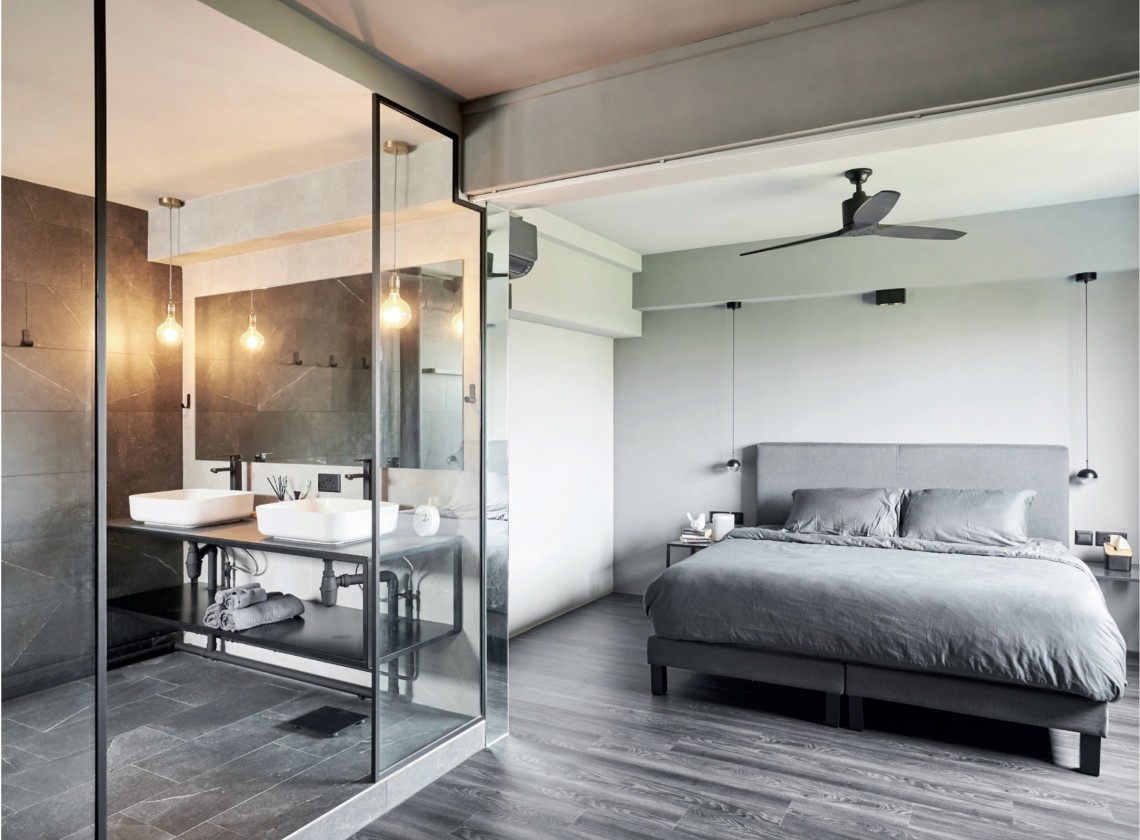
The wall of an adjoining room was knocked down to create a more spacious master bedroom.
photography VEE CHIN art direction KRISTY QUAH


