

Prussian blue and black might seem too sombre for homes, but with the right balance of shine, they create magic in this apartment.


Prussian blue and black might seem too sombre for homes, but with the right balance of shine, they create magic in this apartment.

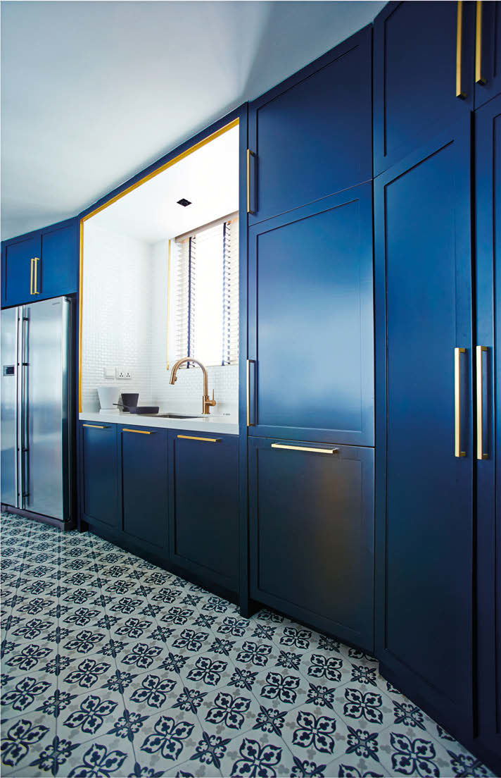
Homeowners Darren Sabom and Sharon Siah first approached architect William Ng from Studio Wills + Architects with a myriad of ideas for their duplex gathered from Pinterest. Their design ideas included the use of prints and patterns, subway and hexagonal tiles, coloured walls and wired glass. Inspiration provided, they left the design up to William, who ensured all these elements were incorporated into the design of the kitchen, yard, and powder room on the first level, and common bathroom, master bedroom and bathroom on the second floor. The clear distinction between the living and kitchen spaces is made by colouring the latter with the homeowners’ favourite colour – blue. Darren wanted an open-concept kitchen so the original walls between the kitchen and powder room were torn down; the powder room was then made smaller.


“We love spending time at home and inviting friends over for dinner, so my favourite space is definitely the kitchen because it’s done with practical use in mind and is a nod to good design,” says Sharon. The kitchen island sports a Caesarstone London Grey countertop – also used in the powder room – which cleanly contrasts with the rich blue of the cabinets. For highlights, William added Schoolhouse Electric brass light fittings above, as well gold cabinet handles.

The art pieces in the kitchen are another way the couple made the space more personal. The piece with cranes painted on fabric was a gift to Darren 15 years ago when he taught English in Japan, while the other is a black-and-white painting by Darren’s sister. “She’s an artist based in Pittsburgh, and gifted the same painting to her parents and siblings. This is one of our favourite pieces of art not just because it’s dramatic, but also because our personal connection to the artist makes it more meaningful,” shares Sharon. On the second level, the bedroom is organised around the colour black – which William chose because it contrasted well with the lightness of the other parts of the home – as can be seen in the use of wired glass, black framed metal doors and the wall panelling behind the bed. This panel conceals the walk-in wardrobe on the other side. Working with a renovation budget of $200,000 (including fixtures), “the design came together far better than expected; it’s all the little touches that work together to make this nest feel like home,” affirms Sharon.


COLOUR LESSONS
In this home, colour is not used so much for visual decoration, but in a more conceptual way to define its spaces, says William. The darker tones were applied “volumetrically” to define and outline the two new “boxes” of blue and black, which were inserted within the lighter-toned interiors. This stems from the team’s architectural background, says William. “We believe that defining new and old spaces is necessary; leaving some traces of the original and its history is important in this renovation.”


