

Q: I am worried that the colour in the paint catalogue won’t look the same on my wall. Any advice on how to choose colours?


Q: I am worried that the colour in the paint catalogue won’t look the same on my wall. Any advice on how to choose colours?

A : We know it is difficult to envision how paint colour will look like on a wall when your only reference is a thumbnail-size square in a paint catalogue, but the great thing about paint is that it’s not permanent. Here are some tips from Bernard Tan of Akzo Nobel Paints, the parent company of Dulux, that you can use to get the best results. It is always recommended to look at your paint catalogue and choose hues under natural daylight to get the most accurate representation of the colour, he says. Looking at colours under different lighting conditions, such as fluorescent or tungsten (warm) lighting, will skew your perception of the shade. Also, bear in mind that the coloured squares in the catalogue are surrounded by white space, and tend to look brighter than when on the actual wall. “The colour usually looks a little ‘darker’ on a large surface like a wall. How much darker it looks is subjective,” says Bernard.
Q: To save money , I’m thinking of painting the walls of my home myself . Is that a good idea ?
A : It all depends on how much time you have, and the desired outcome. For long-lasting results, it is always advisable to prep your walls before painting. That means fixing things such as dents, cracks, holes and flaking paint. Glossy surfaces also need to be sanded down slightly. The walls have to be cleaned so that the paint can go on smoothly and not trap dirt. Then, you’ll have to mask the areas you don’t want paint on, such as wall sockets, window and door frames, and skirtings. If you have furniture in the room, you’ll have to move them out of the way, or cover them up. You might also want to prime your surfaces with a sealer if you’re painting over a newly plastered surface, or repainting a powdery one. And all that comes before you even apply your desired colour. You’ll need two coats of your topcoat paint, letting each coat dry in between. The good news is that new formulations have made paint almost odourfree, so you won’t be inhaling toxic fumes as you paint. If the above just sounds like too much work, big paint companies such as Dulux and Nippon Paints offer professional painting services that will do all of the above prep work – plus arrange a pre-painting site visit – offer a colour consultation, move your furniture for you and provide a warranty for paint defects.

Q: I’m thinking of painting coloured stripes on my living room wall. My concept is a retro funky style. Any advice?
A : Stripes are probably the easiest pattern to execute on a wall with paint and some masking tape, and the vertical lines will visually heighten your space as well. To do the retrolicious look, use bright colours such as red, orange or green. But these colours can be overpowering, so choose either one colour or, at the most, a combination of two in the same colour family for your stripes. For a long wall, have fun by mixing stripes of different widths. If painting is too tedious, MT Casa tapes can create your striped wall. The washi tape comes in widths of 5cm, 10cm and 20cm, and can be pasted on and removed as many times as needed. MT Casa is available at www.mttape.com.sg.
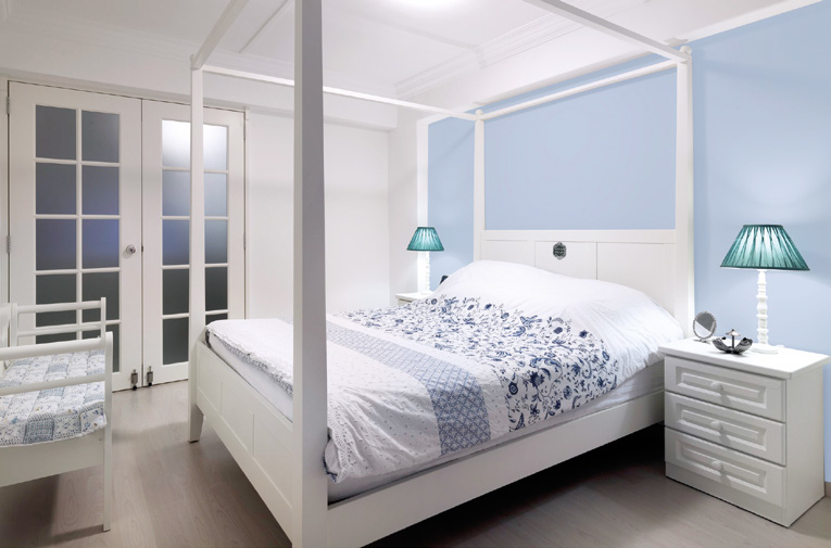
Q: I can ’t change the size of my home, but can I make it look larger using paint?
A : Colours can change the perception we have of a space, so choose your colours wisely if the effect you want is clean and spacious, and not small and cramped. The first rule of thumb is to use light colours, but you don’t have to stick to stark white. “White” comes in different tints; barley white, for example, has a slightly creamy tone, while orchid white has a touch of lavender. In a compact room where you do not want to further “cut up” the space with different colours, you could use a warmer shade of white on the walls, and a cleaner white for the ceiling. There are also some colour tricks you can use. For example, an ombre wall – where a darker colour tone segues to a lighter one above – serves to draw the eye upwards. Just make sure the illusion continues by using the same light [aint colour for the ceiling. Paint company Dulux advises that a darker neutral can be used in a small space if the space is primarily used for relaxation. Just make sure that the trims, such as cornices and skirtings, are all painted in the same colour as well. Its Light & Space range might be pricier than conventional paints, but it is formulated to reflect up to twice as much light to make your space look larger.
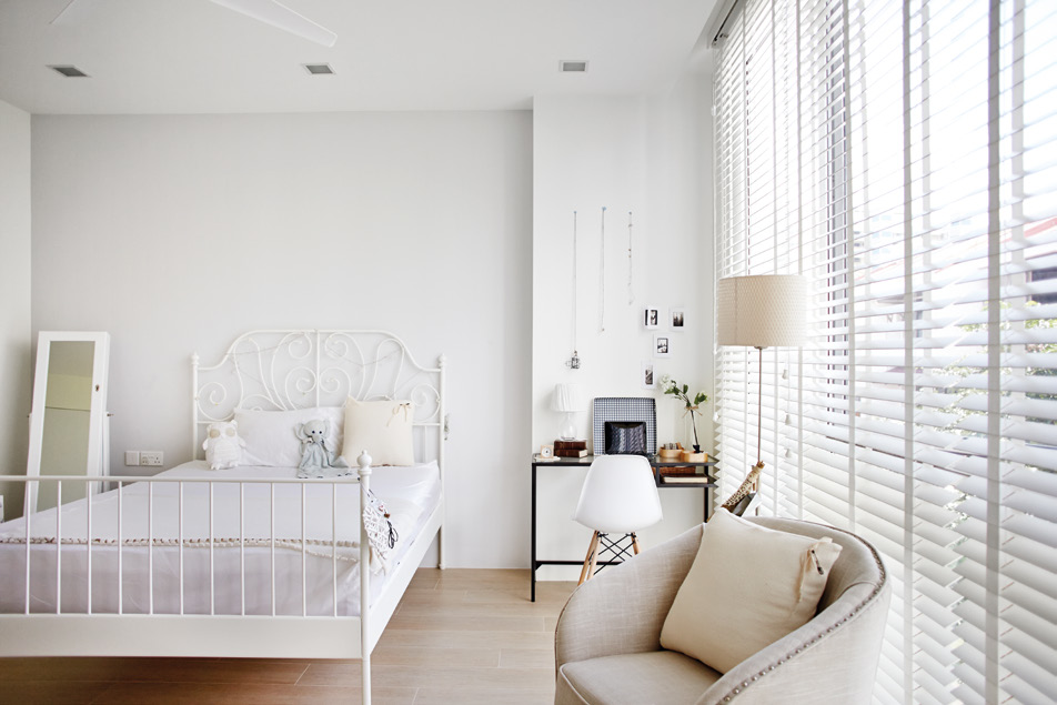
Q: I want the look of a small room in my house to be calm and relaxing, yet chic and cool. What wall colours would you recommend?
A : Make a small space look visually larger but still cosy by using a light rather than a bright or dark colour scheme. A spokesman for Nippon Paint suggests pastel as well as neutral hues such as pink, beige, or pale blues. “A lighter shade of blue has low reflective properties, which diffuses and softens light, making the room feel cool and comfortable.” Here’s another way to make subdued hues interesting. “Use a monochromatic colour scheme on the furniture, rugs and walls, but choose different shades and textures of a single colour,” says designer Joey Khu. “The visual balance of a room is also important. A large, brightly coloured element can overwhelm a room and reduce the appearance of space.”

Q: I would like to give my old metal gate a fresh lick of paint. Do I need to scrape off the old paint before applying the new coat?
A : It’s great that you are picking up the paintbrush to do some simple home improvements! Painting does need some preparation work but, in this case, you do not need to scrape off the old paint unless the current paintwork is badly peeling. For a smooth and long-lasting paint job, remove all loose paint, dirt and grease from the surface, then sand it lightly and dust clean, says a Dulux spokesman. Rough surfaces help the paint stay on longer. If the metal is rusty, apply a zinc-chromate primer, a corrosion-resistant agent. For a healthier working environment, apply a coat of Dulux Waterbased Gloss primer – a lowodour, environmentally friendly product – followed by two coats of paint such as the Dulux Water-based Gloss, which is low in volatile organic compounds and fast-drying.


