

Better known as maker of the iconic Birkin, Hermes has released its latest home collection, and it’s clear that it is a formidable name in the world of furniture and homeware design, too.


Better known as maker of the iconic Birkin, Hermes has released its latest home collection, and it’s clear that it is a formidable name in the world of furniture and homeware design, too.

A plunge into a kaleidoscope of rich and comforting colours – that is perhaps the best way to describe the experience of navigating through Hermes’ multihued wonderland at the recent Milan Design Week.
A presentation so unforgettable requires a site as impressive, and playing host to the occasion is the 137-year old Museo della Permanente, the cultural centre for the society of fine arts and permanent exhibition, in Milan.
Here in the hallowed halls of the former palace, an entourage from the luxury French maison laboured for three weeks, in order to transform the spaces into an enchanting labyrinth of towering pavilions.
From equestrian flair to interior finesse
Founded in 1837 by Thierry Hermes, the lauded house of high fashion grew from humble origins, first as a maker of high-quality wrought harnesses and then as a producer of fine saddlery. Over time, it was the creation of the Kelly, followed by the Birkin, that catapulted the maison into the stratosphere of luxury goods, fashion and apparel.
However, its meteoric rise across social strata hasn’t changed the core philosophy of the brand, which places emphasis on well-honed craftsmanship, attention to detail and a relentless pursuit of perfection.
In 2011, Hermes made a formal entry into the world of furniture design, launching a full-fledged collection in collaboration with Japanese architect Shigeru Ban. Since then, it hasn’t slowed its momentum of launching collections for the home during Milan Design Week.
A village of colours
At the latest edition of the Italian city’s design festival held in April, Hermes ups the ante with a largescale installation, establishing it as an exemplary home furnishing solution, not just a fashion brand doling out token chairs on the side.
One of the most striking highlights is the sheer amount of tiles specially shipped in. In all, 150,000 Moroccan zellige (small glazed ceramic square) tiles clad the seven block-like pavilions, as well as the entrance foyer within the museum.
Conceived by Charlotte Macaux Perelman, co-artistic director of Hermes Maison, and Alexis Fabry, the pavilions are each draped in a different colour. At a glance, the scene resembles a city of glittering adobe-style towers so brilliant in their glow that it makes one wonder if they are a mirage.
“We wanted to work with scale. Most of the pieces this year are small so we created towering structures; the height is emphasised by the use of stairs in the scenography (designed by Herve Sauvage),” Charlotte explains.
Doorways lead in and out of rooms within the towers, allowing visitors to weave through corridors, from one colourfilled setting to another. Amid this unusual chromaticism, the new collections for the home – comprising small objects, furnishings, fabrics and wallpapers – are presented.

Perimetre series
The series comprises a mix of vases and trays, with designs drawn from a combination of natural motifs and patterns inspired by the urban landscape.

Plaid collection
Hermes also unveiled six plaid designs, with geometric and equestrian themes, woven from full cashmere, as well as a mix of cashmere and merino wool.

The Pli’H
This includes comprises trays and desk accessories. Each item is made from a single piece of thick bridle leather, in a rich brick hue. Precision cut, the joints are stitched with four white saddle stitches.

Oria d’Hermes chair
Viewed from the side, the chair’s silhouette features the letter H – one of Hermes’ icons – in a timeless style.

Limited editions
This Double Cheval blanket, designed by Mexican artist Miguel Castro Lenero, features hand-applied block prints and traditional kantha embroidery.

Tibicolor Tray
Perfect as the gathering space for loose change, keys and whatnot, the Tibicolor tray is accented with a bridle leather tab on the side.

The Oasis
Each monocoloured tower presents pieces from the new collection. Here, against the opulent and glossy blue zellige tiles, are key pieces from the Perimetre collection – porcelain vases and trays handmade from unrefined white clay and produced by Mosaic del Sur. The homeware items are conceived by Gianpaolo Pagnie, who also designed the brand’s tangram boxes.

Vis a Vis necklace busts

Attrape Reve scarf holder, designed by Guillaume Delvigne
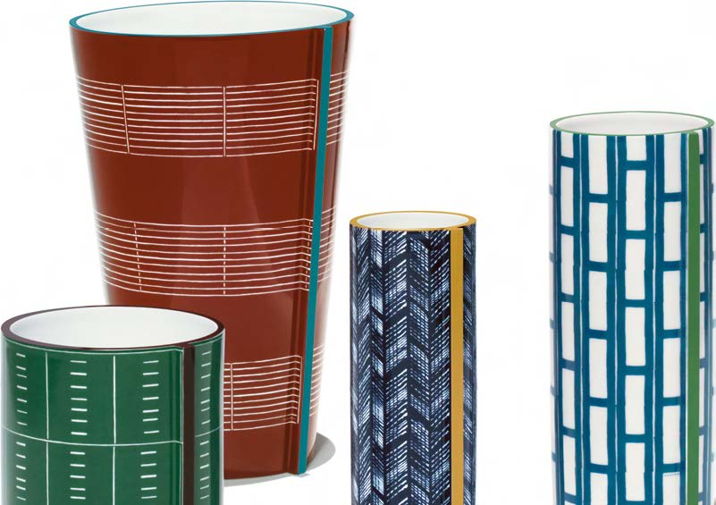
The Perimetre vase collection

Droit Fil scarf box

Vice Versa two-way desk with drawer

Karumi bancet assise bench
FURNITURE & ACCESSORIES
Integrating whimsical aspects with practical solutions for the home and wardrobe, the various pieces of hardware intrigue with timeless looks and elegance.
Always drawing inspiration from its close association with horse riding and saddlery, Hermes has injected leather accents into most of its products. One of the highlights is the Droit Fil scarf box (above), which is inspired by vintage sewing boxes. Made from maplewood and finished in a vibrant orange shade, the box features a handle upholstered in incardine blood orange alligator leather. It can hold up to 18 of your cherished silk scarves.

Plaid Avalon Tangram blanket

Plaid Formes Simples blanket

Squares wallpaper

Circus wallpaper
PLAIDS & WALLPAPER
Whether it’s something for the walls or to add visual warmth while you are curled up in bed, Hermes has you covered.
Nothing is too small a detail or too impossible a task when it comes to achieving perfection at Hermes. This quality-centric philosophy extends to the textile and wallpaper segments. One of the key pieces at the design week, the Avalon Tangram (above left) blanket is made from Nepalese cashmere and features a plaid design made from handdipping the various sections one at a time. The blanket is removed from the dye only when the colours have been absorbed fully by the material. This laborious technique allows the colours to bleed into overlapping sections, while still showing hints of the layers underneath. The result is a mesmerising effect with blurred edges and a lively and multi-layered look.

“I WANTED THE COLLECTION TO REFLECT THE STRUCTURE OF AN ENGLISH GARDEN, BUT ALSO THE WAY NATURE TAKES OVER WHEN YOU LET IT GROW.”
TABLEWARE
This year’s collection features A Walk In The Garden tableware pieces designed by Irish artist Nigel Peake and is based on an English garden theme.
What started as a conversation between Nigel and Benoit Pierre Emery (creative director of Objets et la Table at Hermes) at summertime has blossomed into an entire tableware collection 18 months later. Although Nigel has worked with Hermes prior to this collection, it is his first attempt at designing porcelain pieces. “I wanted the collection to reflect the structure of an English garden, but also the way nature takes over when you let it grow,” says Nigel.

Q&A
There’s a lot of reference to colour and proportion in this year’s launch. Why so? Benoit (right): We wanted to arouse emotions with colour, as soon as you see the collection. It gives you a special perception of the objects when you enter the various rooms at the exhibition, and leaves an indelible impression in your mind.
What interests you about colours?
Nigel (left): In my opinion, colours are like words; you have to use different words in order to form a sentence, so you need to learn to use various colours together while still letting them remain individual elements of a final creation. There are also many shades to a specific colour; the subtlety of colours intrigues me.
What are some images about a garden that came to mind when you were designing these pieces?
N: I immediately thought of something that’s overgrown, vines and things that move in the wind or make a sound, more so than just flowers alone. I like the notion that a garden is a protective space, a secret place you can go to when you want to look at trees, the sky and grass. It’s also a simple place that allows you to be alone and still be in the company of nature.
What were some of the technical challenges you encountered?
B: Getting the right colour was difficult because there aren’t as many colour options available for porcelainmaking as before. It’s not easy to get the strong reds, pinks and oranges that we desired. The other issue was attaining the sharpness of the details when transferring Nigel’s drawings onto porcelain. It’s very hard to control the sharpness of the prints when the porcelain undergoes the baking process.
Text YOUNG LIM Photography HERMES, A. SAMSON


