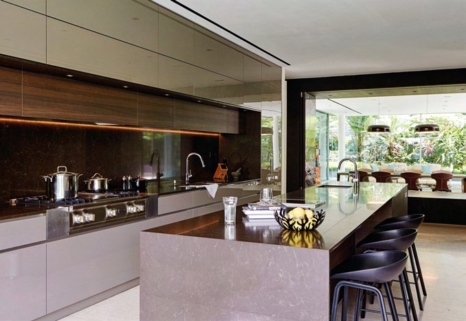
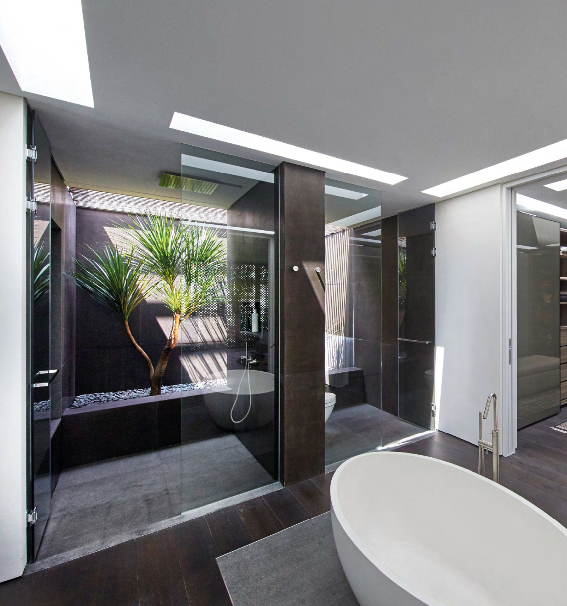
Cold and hard materials, such as metal and concrete, were used to create a warm and welcoming family home. LYNN TAN finds out more about this transformation helmed by an award-winning design team.


WHO LIVES HERE
A couple in their 40s and their two children
HOME
A detached home in Faber Drive
SIZE
Land area 8,375sqf Built-up area 7,355sqf

This is a classic Singaporean story about a couple who wanted to upgrade to a bigger home, one that is within a kilometre of the primary school of choice for their children, and which is also in close proximity to where their parents live. So the Peng family sold their corner terrace and, during the construction of their new detached home, moved into a condominium.
Together with architects Diego Molina and Maria Arango, directors at Ong&Ong, there was a consensus to demolish the original hexagonalshaped house.
“The form and configuration of the original house did not really suit the family’s needs. Although it was a sizeable plot of land, the original house sat right in the middle of the site, leaving only small pockets of garden,” Diego recalls.
The husband-and-wife team approached the project by planning for the house to be built to the side, in order to optimise land usage and accommodate a more generously sized garden and lap pool.
Comprising two rectilinear volumes stacked on top of one another, the massing has a formal language that is subtle and clean. Diego and Maria used a varied palette of materials here, juxtaposing colours and textures, together with some complementarity, to achieve a strikingly bold yet well-restrained effect. Zircon wood makes its first appearance in the facade of the entrance foyer, where it is articulated as vertical battens to create rhythm and texture. The flat roof that cantilevers out between the first and second storey “boxes” is finished in fair faced concrete. The patterns left by the formwork give it an interesting veined texture and it was coated with a sealant that darkened the shade of grey.
With neigbouring houses on three sides – some are as tall as four storeys high and on elevated ground – privacy was a crucial issue that the architects had to address. “We envisioned the retaining-cum-boundary wall as a backdrop for the lush landscaping, which would help provide privacy for the home,” Maria explains.
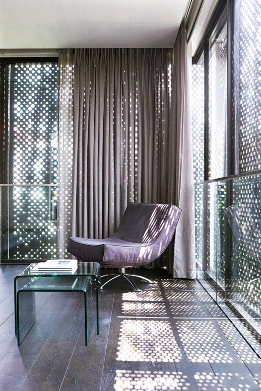
The second storey is clad in black perforated metal screens. This is another solution that the architects devised for privacy, which also serves to provide shade and has become one of the home’s most distinctive features.
The screens borrow imagery from a forest scene, mimicking the effect of light filtering through the forest canopy – creating an intricate play of light and shadow in the interior.


“We experimented with various imagery, materials and perforations. We used a software to help us work out the right algorithm that achieves optimal balance between solid and void. This is important, otherwise the interior will end up too dark or too bright,” Diego elaborates.
At night, the effect is reversed, and the exterior is transformed into an enchanting night forest, with glimpses of light and movement peeking through the perforations, while privacy is still maintained. The homeowners, who are in the oil and gas and shipping businesses, were initially a little hesitant about the screens because it was not a concept that they were familiar with. They say: “But by that stage of our relationship with Diego, Maria and their team, we had learnt to trust their professional instincts. Since they felt so passionately about the metal mesh screens, we figured, why not?”
The project received an Honourable Mention in the Residential Category of the 16th SIA Architectural Design Awards. Diego and Maria attribute part of the success to the open-mindedness of the homeowners. “They had a very clear brief on what they needed, but gave us carte blanche to work on the design, which made it possible to achieve a holistic outcome,” says Maria.
As architects, the couple’s priorities are clear, for this and every single one of their projects. “These are designs that we are proud of as architects, but ultimately, they are our clients’ homes, so they must feel that it is their dream home,” says Maria. And indeed, for the Pengs, their new family home reflects their lifestyle and preferences to perfection.
They say: “Every weekend is like a quasi-holiday break after a stressful work week. It is also when there is more activity at home, as the kids live with their grandparents during the school week. Diego and Maria have worked wonders in translating our layman wishes into a brickand-mortar (plus a lot of glass) reality.”


photography DARREN CHANG & VERNON WONG art direction NONIE CHEN, KAFFY TAN & LIM YI LING


