A series of unconventional solutions to typical constraints led to this contemporary home lookingand feeling like a castle in the clouds. LYNN TAN finds out.


A series of unconventional solutions to typical constraints led to this contemporary home lookingand feeling like a castle in the clouds. LYNN TAN finds out.

In conceptualising the interior design, Selina took these requirements and more into consideration. “As this is a micro apartment, we adopted a more minimalist approach and incorporated elements that help to reduce clutter and bring a lightness to the space,” she says. Budget was another aspect that was carefully considered.
In order to keep within the client’s budget, Selina worked with the original flooring, doors and frames, but without compromising on the design intent. We take a look at the ingenious design solutions that Selina proposed.
The challenge for the bedrooms was to create a sizeable wardrobe and still have sufficient space for a queensize bed. The straightforward solution would have been to simply convert the second bedroom into a walk-in wardrobe. But doing that in a two-bedroom apartment would leave him with just one bedroom.
“We decided to take advantage of the high ceiling and introduced a loft that effectively doubles the usable floor area,” Selina explains. The original wardrobe in the master bedroom was removed, along with a non-structural wall. The space was reconfigured so that a loft for a queen-size bed could be constructed, with access via a custom-made ladder.
Below the platform, Selina created a walk-in wardrobe. “At 2.2m, the walk-in wardrobe’s headroom is just slightly lower than usual, but the space stores so much more than the original two-door built-in wardrobe,” she elaborates. There is even a hidden compartment behind one side of the wardrobe that provides much-needed additional storage space.
COOKING UP SOME SPACE
The original kitchen was openconcept, comprising a row of built-in cabinets, hob, oven, sink, washer and dryer lined up against the wall to the left of the main door. “There was no proper dining space due to the apartment’s limited floor area, and I was initially prepared to simply prop a small dining table against the wall facing the kitchen,” Ernest recalls.
However, Selina was adamant against having a conventional fold-down table or trying to fit a table for four when the client had no need for so many seats. She suggested a kitchen island instead, which surprised Ernest. “I did not think that we would have sufficient space for it,” he says. Selina designed the kitchen island as a feature with a dining table perpendicular to it at one end, in an L-shaped configuration. The island incorporates drawers on one side, which provide extra storage for crockery and utensils. Two high stools were added to the dining table and this is where Ernest and his girlfriend enjoy their meals together. “I cook almost everyday when I am not flying, so the island is a really useful addition,” he comments.
FELINES FIRST
The space below the dining table attached to the kitchen island also conceals Chevy and Lexie’s food bowls and cat litter. This provides a designated spot for their daily routines, while visually screening off any potential clutter or mess.
The cats freely roam the apartment, but their favourite hangout spots are the cat shelves that Selina designed just for them. Mounted on the wall behind the TV console, the shelves resemble regular wall shelves, except they are staggered like steps and have inclines integrated to make the “obstacle course” more fun to play on.
According to Ernest, the cat shelves are very well-used by Chevy and Lexie. Of course, this does not stop them from exploring other inviting spots around the home, from the top of cabinets and over Ernest’s chin-up bar, to the loft platform and within the recesses of the walk-in wardrobe.


Having moved in a little more than a year ago, Ernest has settled in nicely with his feline housemates.
With some careful design considerations, having pets at home need not be a messy affair.


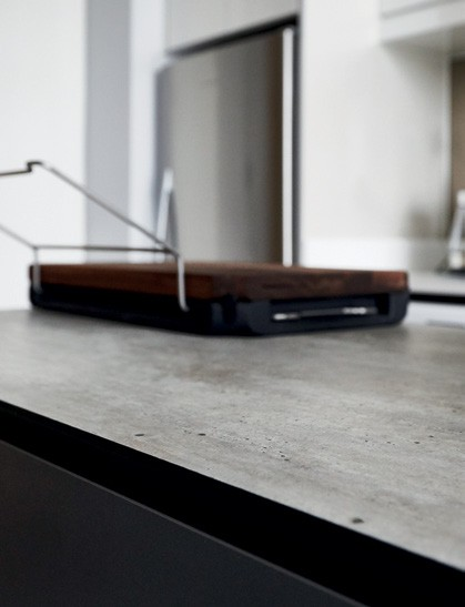
The kitchen island features a textured engineered walnut veneer and a Kompacplus countertop in Denver Travertine.
The kitchen has a cool neutral palette comprising grey engineered wood cabinetry and a white quartz countertop.

photography COLLECTIVE DESIGNS & DARREN CHANG art direction NONIE CHEN


