This old flat was transformed into a gallery-like abode to showcase the homeowner’s creativity and style.


HOME
Three-room HDB flat in Everton Park
WHO
A bachelor in his 30s

LEFT
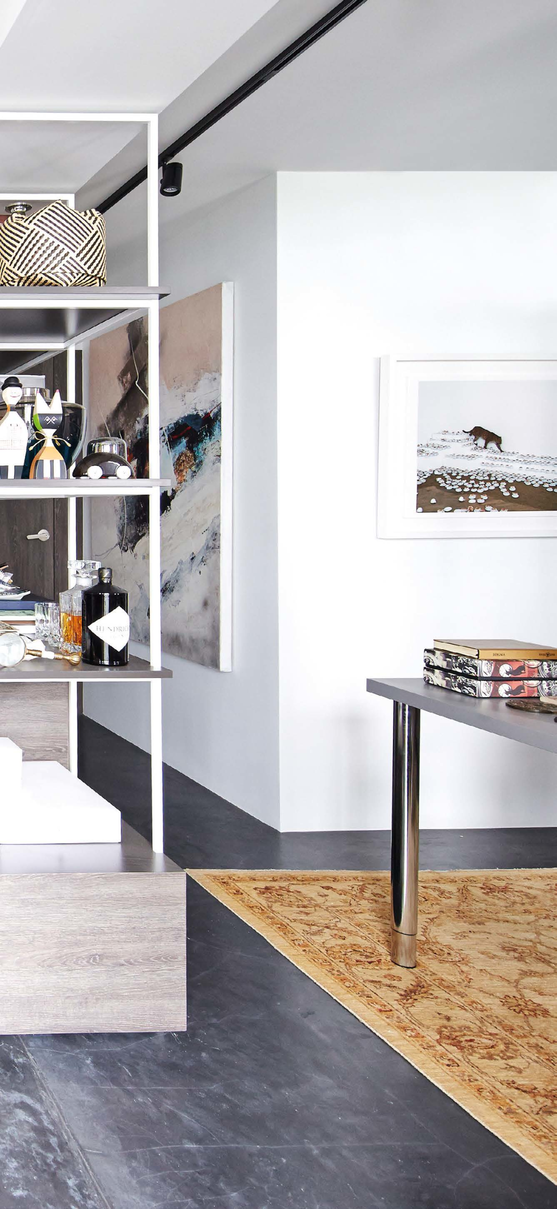
Black concrete screed flooring, white walls and clean-cut built-in structures are the foundation of this tastefully decorated gallery-like home.

“I bought this flat the instant I turned 35,” homeowner Aaron De Silva says, referring to his resale Housing Board (HDB) three-room flat in Everton Park. The HDB allows singles aged only 35 and above to own its flats.
Aaron was drawn to the area because of its “mix of old and new, convenience and vibrancy”, even though he knew he had to renovate the flat quite extensively in order for it to suit his lifestyle. He ended up splashing $64,000 on the renovation, with a further $56,000 on furnishings, appliances and art.
As a freelance editor and art director in the media industry, he wanted “a home that would inspire him”. A proper study area – one that is open and connected to the other spaces – was especially important, as he works from home. He says: “I needed it to be spacious, as I have lots of reference books and 1,001 press kits and materials!” As such, the design team from Artistroom demolished the walls of the second bedroom to make way for an open-concept study.
The designers also custom-made wallto- wall display shelving with slim, linear 130

LEFT
Aaron, a freelance editor and art director, finds inspiration in his collection of books, decor objects, art, and furniture from Xtra, Etsy, Boconcept, Space, Fritz Hansen, Grafunkt and Ikea.
ABOVEA
spacious study, the main requirement of the homeowner, was created by sacrificing one of the bedrooms and making the master bedroom smaller.

This apartment’s Italian-inspired design is complemented by the homeowner’s collection of curios.

BELOW
The home’s design is inspired by contemporary Italian style, with a clean, architectural look and understated colours. It’s complementd by pops of colour in the soft furnishings and accessories.
RIGHT
Aaron manages to artfully curate and fi nd a place for everything, without making the compact home look cluttered.


RIGHT
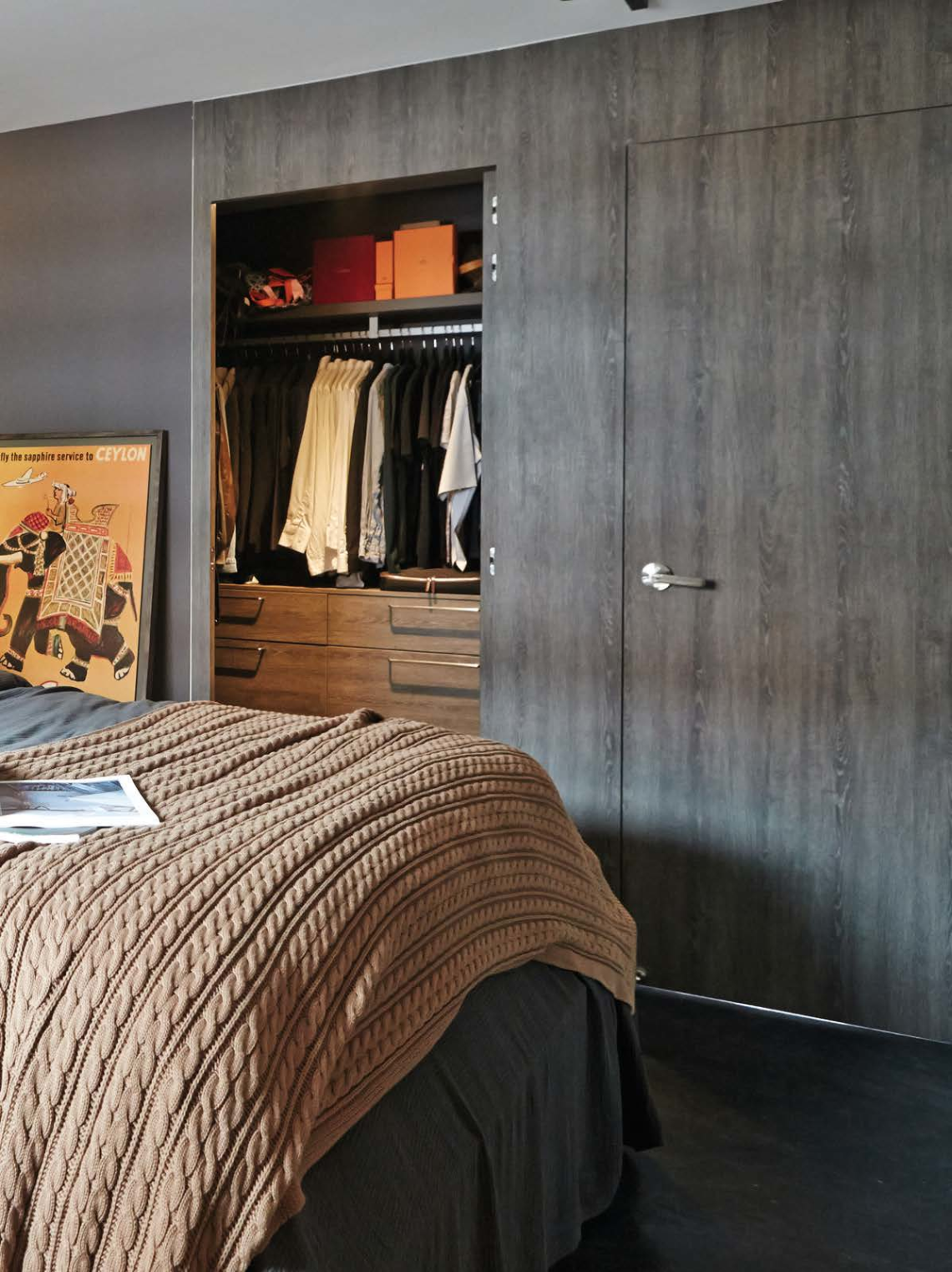
The master bedroom’s size was reduced to make way for a walk-in wardrobe, but it still feels comfortable, due to the minimalist-style furniture.
BELOW , LEFT
In the open-concept dining area, wall-mounted shelves display photos, prints and paintings in an assortment of frames.
BELOW , RIGHT
Half of the original kitchen was turned into a roomy laundry area.
OPPOSITE
White and slate-look laminates, as well as Italian stone-like homogeneous tiles from Rice, make for a sophisticated galley-style kitchen.

aluminium frames, in the study. Aaron’s extensive collection of curios, antiques, art pieces and books, amassed over the years, have all found a place on these shelves, infusing the cosy home with his personality and letting him show off his treasures.
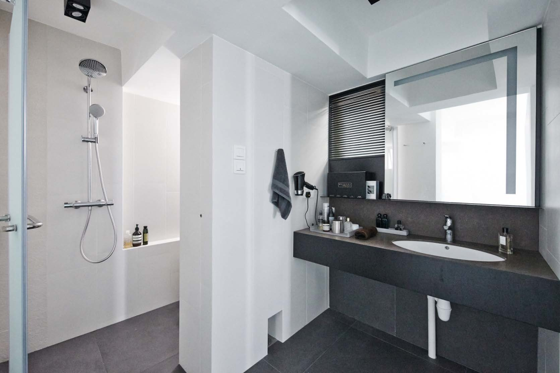
The footprint of the master bedroom was reduced; its walls were demolished and rebuilt to make way for a walk-in wardrobe and additional circulation space around the main living area. Downsizing the kitchen also contributed to the bigger open-concept living and dining area. Another key structural alteration is the new doorway from the master bedroom to the only bathroom in the flat, located near the kitchen.
As for aesthetics, the design team gave Aaron’s home a clean and sleek look inspired by Italian design, with a masculine colour palette of black, grey, white and dark wood tones. However, the walls were kept white, in order to best exhibit the homeowner’s many paintings, photos and prints – adding to the gallery-like feel of his stylish, curated home!
WHERE TO GO
Artistroom, TEL: 6557-0244


LEFT
Reworking the bathroom meant that a dedicated vanity area, which bridges the master bedroom to the shower area, was possible.

SMALL - SPACES TRATEGY
Sacrificing the kitchen and private areas – doing away with one bedroom and making the master bedroom smaller – to gain space for other uses.


