This five-bedroom family home was built on good architectural bones and a great relationship between the owner and the designers. ASIH JENIE find out more.


The muted material palette allows the owner’s vintage and designer furniture pieces to stand out.
WHO LIVES HERE
A couple in their 40s, their son and daughter, and a helper
HOME Five-bedroom condominium
SIZE 2,142 sq ft
In the 1970s, there were two major types of residential typology in Singapore: landed properties and Housing & Development Board (HDB) flats. They occupied different ends of the market spectrum, with few other options between them. The government ceased developing landed property that same decade in favour of pushing for more vertical, multi-residential typologies. The main challenge was enticing landed property owners to switch to high-rise living which, at the time, meant units in small, soulless blocks void of community space.
Thankfully, the end of the decade saw a crop of towering condominiums – a fresh concept then – that attempted to bridge the gap with communal facilities such as swimming pools, tennis courts, barbecue pits, gardens and, perhaps most importantly, spacious units comparable to terrace homes that could comfortably house families.
That was what drew homeowner Raymond Quah to this 1,800 sq ft condominium unit in the Upper Bukit Timah area. Built in 1978 by the architect of Pearl Bank Apartments, the split-level unit offered ample space for Raymond, wife Karina, their son, aged 12, daughter, aged 9, and a helper. “When we bought the unit, it was in very basic condition. The last renovation was probably 30 years prior, so it needed a lot of work,” he tells us. “But the place had good bones. All the rooms were of a good size and the entire layout was very linear; no awkward or unusable spaces."

The hallway is lined with the Tria Shelving System from Spanish brand Mobles 114.
Raymond owns Pomelo, a furniture store (not to be confused with the fashion brand) at Tan Boon Liat Building, and has an extensive network of interior designer friends. He chose Artistroom, helmed by Mark Chen and Katy Chong, to renovate his family's new home. “Their work is sensitive to clients’ needs and offers specific solutions for each one. They're not about cookie-cutter designs or styles that can overwhelm a client’s taste or requirements,” he elaborates.“I've seen projects where a designer's hallmarks are unmistakable – right down to the furniture and accessory choices. Tragically, they don't have any sign of the owners' personalities. Of course, there is nothing wrong with this. It’s just not for us.”
In addition to a comfortable bedroom and bathroom for everyone, the brief also included requests for an entertainment room, two dining spaces (one for hosting and another that could double as the children's study area) and a bigger kitchen.
“We changed the layout quite a fair bit,” shares Mark. The split-level apartment neatly divides the living and service functions by elevation. On the upper level, Artistroom reorientated the configuration of the kitchen, the dining area and the yard, as well as the family room to create a bigger kitchen, a smaller dining space, a spare bedroom and a helper’s room. “We wanted to encourage more storage, air and light into space,” Mark explains.

The family room on the upper level doubles as a spare bedroom while the children use the second dining space as a study area.

The dining room on the lower level is decked with a mix of designer chairs. The ceiling-mounted projector makes for merry movie nights in the adjacent living area.
"IT WAS IMPORTANT THAT KEY PIECES OF FURNITURE STOOD OUT, SO WE WORKED THE AESTHETICS AND MATERIAL PALETTE AROUND THEM."
– MARK CHEN, ARTISTROOM
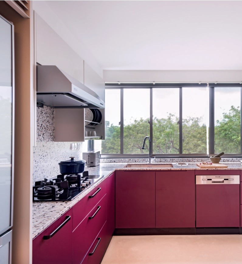
“We prepare our meals together every day, and even more so in these past few months. You can never have enough storage in the kitchen, and who couldn’t use an extra metre or two of countertop?” says Raymond. Pizza is a family favourite, while chicken is almost a staple. He adds, “We have a rotating chicken dinner night – roasted chicken, chicken rice, smoked chicken, chicken curry. We recently started making corn tortillas, so taco night will, hopefully, become a regular feature.”
Artistroom kept most of the original layout of the lower level, which comprises a larger living-dining space, the children’s bedrooms and the master suite. Parts of the living room and the master bedroom balconies were brought indoors and added to the children’s bedrooms as study nooks. Each has an attached bathroom, too. “A big plus when you have a son and daughter approaching their teenage years – no waiting or fighting for the bathroom,” says Raymond.
The material palette comprises stained plywood cabinetry as well as white terrazzo and African wenge wood floorings. “It was important that key pieces of furniture stood out, so we worked the aesthetics and material palette around them,” says Mark. The result is a cosy interior brimming with personality that complements the architectural shell.
Just about every piece of furniture, including the Tria Shelving System from Mobles 114 in the hallway and the children's bedrooms, came from Pomelo. Some, like the Mrs B table from Benchmark and the vintage teak armchairs, have been with the family for years. One exception is the specially ordered Punt Stockholm media console. “My belief has always been that if I wouldn’t have something in my home, I won’t sell it to you,” says Raymond. “If a furniture store owner doesn't use any of the brands himself, you should be worried.”

The study nook in the daughter's bedroom used to be part of the living room balcony.

Cool solid colours and soft lighting create a cosy ambience in the master bedroom.

Clad in white terrazzo and solid burgundy cabinetry, the kitchen provides ample space for a family that cooks together.
Photo EDWARD HENDRICKS


