Still a gorgeous smartwatch, but there aren’t enough improvements to justify its new higher price point.


Motorola Moto 360 (2nd Gen)
The original Motorola Moto 360 was a favorite last year. With its minimalist round design, and stainless steel and glass build, it was one of the few smartwatches that didn’t make you look like a total nerd. This year, there’s a new Moto 360. It comes in two sizes (and three editions): a black 42mm model, a rose gold 42mm ‘ladies’ edition, and a silver 46mm version (the same size as last year’s).
Unfortunately, whichever version you like, they’re all more exorbitant, coming in at $479 (42mm black), $499 (42mm rose gold) and $549 (46mm silver) respectively. The design hasn’t changed much from last year, with the same chunky round stainless steel case and a glass display that’s slightly raised above the case with an angled bevel on the edge. This is to make swiping the watch face easier, but it also causes some weird distortion towards the edge of the screen.
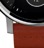
The biggest difference, design-wise, is that the new Moto 360 now has lugs on the top and bottom that make it look more like a watch than last year’s disc-on-a-strap style, but also less unique. The lugs also let you easily replace the watch strap.
Another minor change is that the side button has been moved up from the 3 o’clock position to the 2 o’clock position. It’s still not a real watch crown though and doesn’t rotate, so you can’t use it to scroll through apps: it only dims the display and accesses the app menu.


AT A GLANCE
OS Android Wear, Processor Qualcomm Snapdragon 400 quad-core 1.2GHz, Display 42mm: 1.37-inch 360 x 325 (263ppi) LCD / 46mm: 1.56-inch 360 x 330 (233ppi) LCD, RAM 512MB, Storage 4GB, Dimensions 42mm: 42 x 11.4mm / 46mm: 46 x 11.4mm.
The 42mm Moto 360 uses a 1.37-inch display with a 360 x 325 pixels resolution (263ppi), while the 46mm model has a 1.56-inch display with a 360 x 330 pixels resolution (233ppi). That’s a slight improvement from last year. Both displays look decent enough, but aren’t as bright as the AMOLED displays found on the ASUS ZenWatch 2, Samsung Gear S2 or Huawei Watch. As a result, legibility, especially under bright light, just isn’t as good. For what it’s worth, those other watches all have higher resolutions too.
Like last year’s model, the Moto 360’s display isn’t a complete circle - there’s a black bar at the bottom of the screen. The bar, which many Moto 360 users refer to as the “flat tire” is where the ambient light sensor is housed. This light sensor lets the display have an always-on mode that automatically adjusts the display brightness according to your surroundings. It sounds convenient, but in my opinion, not worth the cost of cutting out a portion of the screen. Furthermore, I found the auto brightness to be a little slow to adjust and it generally sets a lower brightness level than I would want.
Motorola claims that the ambient light “flat tire” is necessary, but since every other round smartwatch out there doesn’t include it, I really don’t think it is. It continues to be a real eyesore on light-colored watch faces and pretty much makes any non-black watch face look bad.
As expected, the Moto 360 runs on Android Wear. Motorola has included some exclusive new watch faces with tappable widgets that can display weather, step count, battery, day/date, and more. Having said that, these watch faces have also been added to the older Moto 360 via software updates, so functionally, the watch is no different from the older one.
Motorola has upgraded the fitness-tracking features in the new Moto 360 though, and it can now count steps, read heart rate and estimate calorie burn. There’s also a dedicated smartphone companion app called Moto Body to help you track your progress.
Internally, the new Moto 360 has gotten a few upgrades. You get a standard 1.2GHz quad-core Snapdragon 400 processor, 512MB of RAM and 4GB of internal storage. While this is a nice improvement over last year’s plodding Texas Instruments OMAP 3 processor, it’s just playing catch up to other Android Wear smartwatches.
As for battery life, the 42mm Moto 360 has a 300mAh battery, while the 46mm version has a 400mAh battery. Our 42mm unit lasted about 15 hours of moderate usage. Charging is done via a simple wireless charging dock that automatically displays a nightstand clock mode when charging.
While we loved the original Moto 360 for its stylish, stand-out design, now that there a ton of similar round-faced smartwatches out there, the 2015 model doesn’t have quite the same appeal.


CONCLUSION
Still a gorgeous smartwatch, but there aren’t enough improvements to justify its new higher price point.


