Daniel Boey – Singapore’s “Godfather of Fashion” – has injected his fashion-fuelled home with a unique sense of style.


Daniel Boey – Singapore’s “Godfather of Fashion” – has injected his fashion-fuelled home with a unique sense of style.

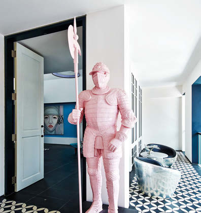
Innovative, daring and cutting-edge, Daniel Boey has been at the forefront of the Singapore fashion scene for decades – and he uses these same qualities to create his extraordinary home. As you’d expect from someone who has made style his business, Daniel’s home is a visual feast of the beautiful, quirky and luxurious. Among the contemporary, retro and antique items, whether it’s the antique dowry chest that belonged to his great grandmother, or an artwork made of Lego that was done for his 50th birthday – there’s a fascinating story behind every item in his home. The bachelor jokes that this house is, in fact, that of “Daniel and friends”. This is because so many of the artworks and furniture were gifts from friends – many of which were given when he had his joint housewarming and 50th birthday party last year.


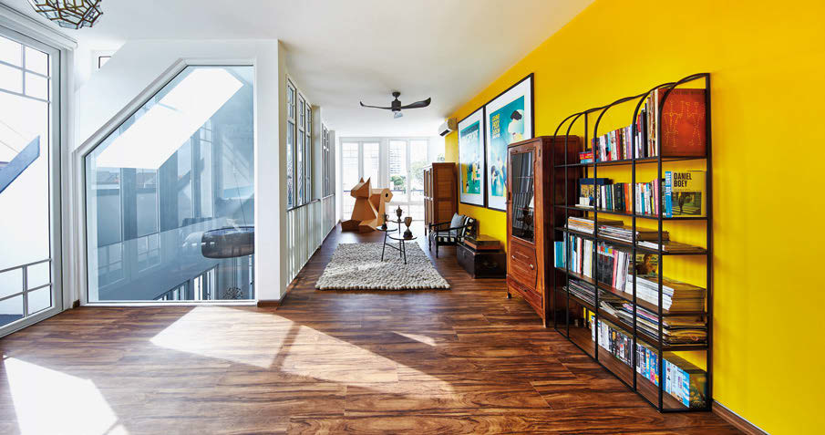
Colour is central to this home as well. The vibrant turquoise in the living space and stairwell are the perfect backdrop for his spectacular artworks and striking furniture. Upstairs, banana yellow fills the entire top floor of the home with a radiant energy. Daniel worked with Nippon Paint to help him with all the paint choices throughout the house. “I just love colour. Colour makes me happy!” says the homeowner. “People are so often afraid to use colour, but if you change your mind or get bored of it, you can simply paint over it,” he says. The homeowner bought much of his furniture from Lorgan’s the Retro Store. “The owner, Lorgan Wong, would often call me and say ‘I have the perfect thing for you!’ and nine out of ten times, he has been right.” Daniel’s new home is one-half of two semi-detached structures – the other belongs to his parents. He worked with architect Tan Li Chiat of TLCA Architects to create his dream abode. Daniel says: “One of my early briefs to the architect was that I wanted plenty of natural light, great cross-ventilation and large open spaces. I wanted it to be ‘like three open lofts piled on top of each other’. It also had to be versatile enough for me to change the look of the interiors. We were on the same page in so many ways and had such a similar vision and ideas. We worked really well together and I’m delighted with the outcome.”


DANIEL ON THE COLOURS USED
“While I love the dramatic black and white exterior, I can’t imagine living in an all-white interior (it would make the space look a lot bigger; but how bland!) so I decided to pepper the spaces with pops of colour. Colour is a great way to define spaces and give each space a strong identity.
The myriad of colours are all tied together with the teal walls framing the staircase (the colour matches the ‘Cartier red’, ‘Hermes orange’ and ‘Kate Spade Saturday yellow’ spaces on the three floors). That is the key to playing with colours in the house – you need to find a unifying factor that serves as an anchor, to prevent it from becoming ‘rojak’
Don’t mash too many colours in one singular space, as it’ll have the opposite effect. Choose a singular feature wall for that strong colour – that becomes the centre of the room. Remember to pick furniture that complements that colour, too
Don’t be afraid of experimenting with graphic patterns. I painted one wall of my walk-in wardrobe (and the bomb shelter) in horizontal orange and vermilion stripes, which complement the solid orange wall (anchored by an Erica Hestu painting and a customised gold chesterfield sofa). It makes an interesting alternative to a plain wall of colour.”


