ELIZA HAMIZAH takes you through the transformation of an old, small flat in barcelona into a chic and trendy space for a fashionable Italian woman


A pink terrazzo like quartz surface, warm grey cabinetry, and vintage concave brass handles make up this chic kitchen.
The dark blue cabinets are designed to be symmetrical and mirror the balcony windows.

Colours and curves dominate this vibrant apartment in Barcelona, which belongs to Francesca, a young and stylish Italian professional in the fashion industry. After tearing down all non-structural walls, the designers from Colombo and Serboli Architecture (Casa) worked on the apartment’s visual anchor – the element that informs the rest of the 699 sq ft space.
This takes the form of a voluminous bespoke storage unit in the foyer. Clad in deepblue and light pink finishes, the floor-to-celling unit creats a grand doorway. The blue visually condenses the area, while the tall pink panels allow a transition before one steps into the larger and brighter openplan living area. It also conceals a walk-in wardrobe (home to Francesca’s large collection of clothing and sports equipment) and an entrance to the master bedroom.
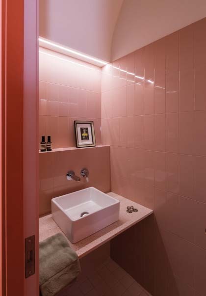
In the same vein is a coral, arc-shaped volume in the kitchen. While its eye-catching hue and large size catch the eye, this "container" also conceals. Swing open the coral door to reveal a pink-on-pink powder room, which features subway tiles and a pink terrazzo-like quartz surface.
"We opted for an are shape, and at a height that almost touches the wooden-beam ceilings, to highlight the 4m -hight vaulted ceillings of this 13th-century building. These (new features) enhance the great proportions the old property into a vibrant flat," say the disegners from Casa.

Walls and ceilings painted in white increase the brightness of the home.
The rounded peninsula hosts a sink and dishwasher. It also serves as another dining area for the homeowner and her guests. The master bedroom is accessed through a door that matches, in colour and size, the wardrobe door in the foyer.

“THE ARC-SHAPED DOORWAY HIGHLIGHTS THE 4M-HIGH CEILING OF THIS 13TH-CENTURY BUILDING.” – COLOMBO AND SERBOLI ARCHITECTURE
photos ROBERTO RUIZ art direction COLOMBO AND SERBOLI ARCHITECTURE


