With the tall open spaces and panoramic views, the interiors of this penthouse required a controlled hand for its interiors.


With the tall open spaces and panoramic views, the interiors of this penthouse required a controlled hand for its interiors.


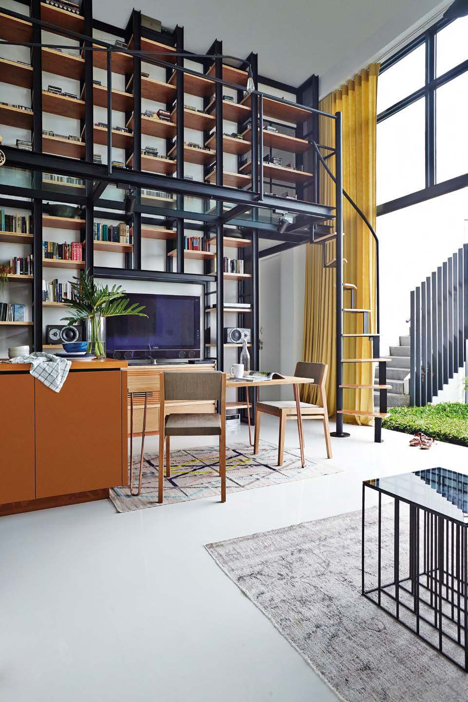
Penthouses have a lot to live up to, being synonymous with luxury and glamour. This unit on the 24th floor of a condominium block, located at Upper Bukit Timah, fulfils the expectations with knockout vistas of greenery, sleek interiors and enviable outdoor living space. Being their third home together, Shark Fung and Sharon Goh knew what they wanted the space to look like, but only a trained interior designer could advise on the changes necessary to the layout. Sharon called someone she’s known for 20 years, Mark Young from PIU Design, and zeroed in on a double-height bookcase he had designed some time ago. “That was exactly what we needed for the tall living room wall to house Shark’s collection of CDs and books,” she says. To provide access to the upper storey of the bookcase, Mark eschewed the conventional movable ladder in favour of a modified spiral staircase that leads to a narrow catwalk. “I kept the catwalk to 800mm in width to comply with building regulations and designed a skeletal staircase that takes up minimal footprint,” he says.


The style of the staircase, which has plywood planks as treads, is repeated in the bedroomturned- walk-in wardrobe (for how else is Sharon going to access her double-height mirrored wardrobe?). This design roughly increases the couple’s wardrobe space seven-fold. Mark’s boldest stroke lies in the kitchen, where he transformed the insipid wood and grey of the cabinetry and flooring into a showcase of jewel green. “Green was a natural choice as it borrows from the apartment’s surroundings. So I offered the couple a few choices. They went straight for the deep green which I call British racing green, but Shark calls it ‘Rolex green’!” Mark explains. The existing kitchen was closed off from the living room and felt annexed from the apartment’s airiness and grand views. “It was a shame for Shark, who does the cooking, to be left out,” says Mark. The colour on the cabinet doors come from powder-coated electro galvanised sheets, which replaced the former wood-like laminate cladding. “They are rustproof, like stainless steel, but cost less compared to powder-coated stainless steel,” says Mark, whose experience in commercial and furniture design has exposed him to non-standard renovation materials. The former grey wall tiles were blasted with matching green epoxy paint, and the floor and countertop were clad with mosaic in subtle variations of the main green.


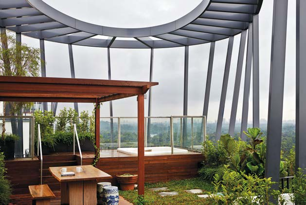
The penthouse’s greatest surprise might be what lies above it. The first delight is the genuine grass lawn in the balcony. “I’ve always dreamed of living in landed property and this is my compromise, so no artificial grass for me!” says Shark. As pearl grass is slow growing, it never needs mowing, which makes it ideal for apartments. A short flight of steps leads to the rooftop terrace with a Jacuzzi. The idea here is to create a fully functional extension of the indoor living area, and it includes elements such as cement pavers set into the grass lawn, a wooden deck, a trellis and a built-in barbecue pit with a side sink. As an after-hours composer and musician, Shark craves the openness to nature and embraces the elements as it provides balance. “So many objects in urban life are man-made and we need the negative ions from the rain, thunder and trees to counter them,” he explains.


