

The world isn’t what it looks like. By Alvin Soon.


The world isn’t what it looks like. By Alvin Soon.
PROJECTIONS AROUND THE WORLD

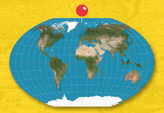
MERCATOR
Probably the most popular map on the planet (Google Maps uses it), the Mercator projection debuted in 1569. Good for navigation, but the map distorts land area.
I love maps. I own a few, and can’t resist looking at new ones. As much as I’ve loved them for their aesthetic, I’d never considered their math; geometry makes me woozy, and I’d assumed that smart people somewhere must have been taking care of their accuracy — right?
Well, yes. And no. It turns out that every map is inaccurate in some way; that’s what invariably happens when you try to represent a 3D globe on a 2D surface. All maps are projections, a transformation of the locations on the surface of a sphere into locations on a plane.
Since it’s not possible to get a perfect projection, cartographers — the smart people — accept some distortions based on what the map is used for, and the scale of those distortions.
The most widespread map projection, for example, is the Mercator projection. It’s likely the map you remember when you imagine the world. The Mercator was first presented by the Flemish cartographer Gerardus Mercator in 1569, and was a great aid for sailors because it represented straight lines of constant courses, making it easy to plot a course over a curved surface.
But the Mercator projection also distorts the size of objects as the latitude increases from the Equator to the poles, which is why Greenland appears the same size as Africa, when it’s really about 14 times smaller. The Mercator projection wasn’t a completely accurate representation of the world, but it worked well enough for navigating the seas. And yet, a map isn’t just for utility, it can also color the way you see the world.
In the Mercator projection, for example, Africa looks as big as North America. But in fact, Africa is big enough to fit the United States, China, India, East Europe and still have enough space for Japan, Italy and France, plus more. This problem of inaccurate perception is why there are a wide variety of map projections, each with its own strengths and weaknesses.
So what’s a map-lover to do? Besides appreciating how a map contains both a bit of truth and a bit of pretense, the easiest answer is to get a globe, which can show the geography of our sphere in true perspective.
VAN DER GRINTEN
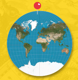
The Van der Grinten projection, introduced in 1904, doesn’t differ much from the Mercator. It projects the Earth onto a circle, but land area is still distorted.

ROBINSON
The National Geographic Society replaced the Van der Grinten, in use since 1922, with the Robinson projection in 1988. It has far less size distortions, and more accurate shapes.

GALL-PETERS
Arno Peters presented and popularized this map in 1973, but James Gall first described a similar map in 1855. The map preserves area, but distorts distance and shapes.
WINKEL-TRIPEL
In 1998, the National Geographic Society replaced the Robinson with the Winkel-Tripel projection, which reduces the distortion of land area near the poles.

DYMAXION BUCKMINSTER
Fuller revealed the Dymaxion map in 1943. It projects the map onto an icosahedron, without visual distortions, but the map breaks both longitude and latitude.


